Treemap Visualization
The Treemap Visualization presents two levels of detail:
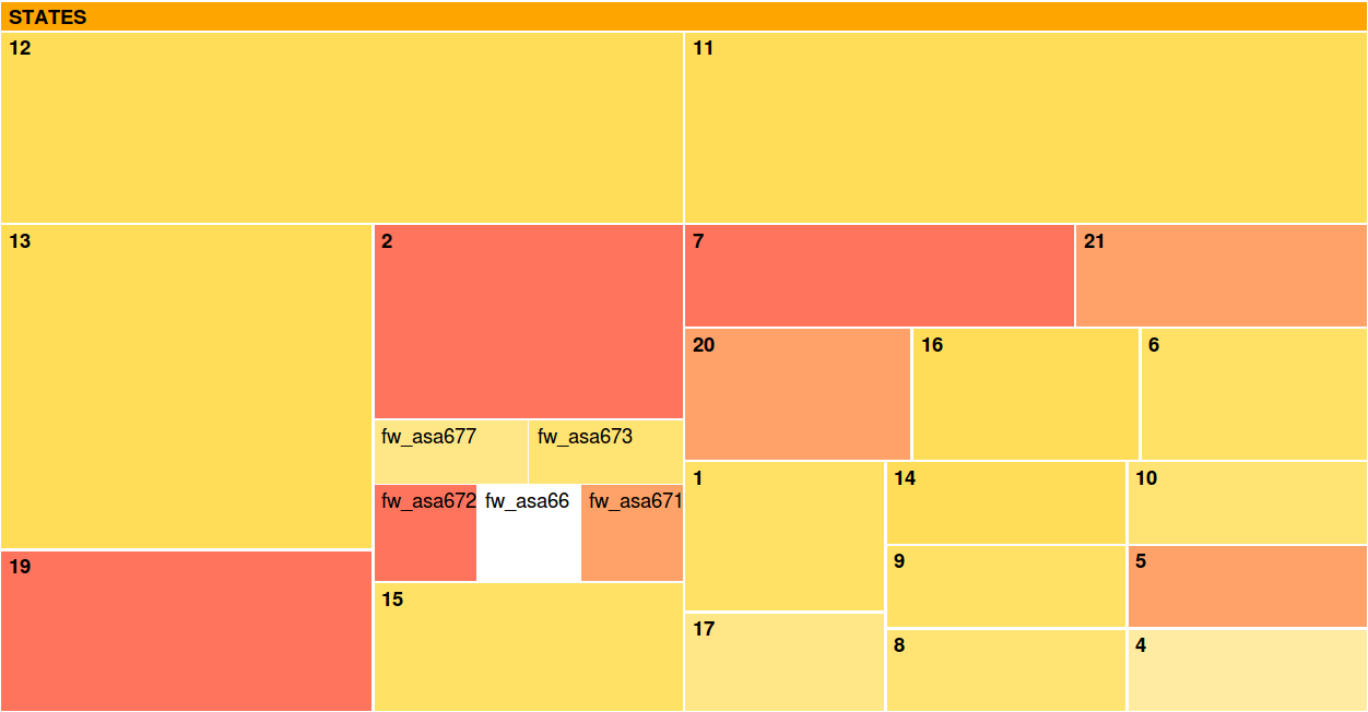
State level : This is the first level where the groups of variables are depicted as rectangles.
The size of the groups depend on the number of variables within.
Variable level : This is the second level of detail, shown through an interactive visual
interface when the user places the mouse on a specific state. In such a case, the detail
of the group is depicted, showing the variables within the state. Also, the variables
are shown in any other state they belong to.
The variables belonging a specific state can be explored clicking on the state to get a zoom of the area of interest.
The original view can be accessed by clicking on the top rectangle with the title "STATES.followed by the number of the state we are exploring".
Both states and variables are shown with a color code. The color code of the treemap visualization is
based on user defined values we call weights. Weights are defined taking into account the
following:
The color of the state is equal to the color of the most relevant variable grouped in
it. This way, in the exploration phase we should first review the states whose color
is closer to red, since those would contain variables marked a-priori as relevant.
The color of the variables represents the relevance of each variable from white to
red going through yellow. The most relevant variables are closer to red and the less
relevant ones are closer to white. The definition of relevance is data specific.
How to use it?
1rs, you need to build a Matlab .mat file with the variables bellow:
"names" cell array of 1xN for N the number of variables. Element i in the cell array should contain a string with the name of variable i.
"states" cell array of 1xN. Element i in the cell array should contain an array with the states variable i belongs to, if any.
"weights" array of doubles 1xN. All the elements are between 0 and 1 and element i represents a level of relevance of the variable i.
You can find a .mat example here with the right variable names and structures. The weights represent the severity in terms of security. These data have been used in the paper J. Camacho, G. Maciá Fernández, J. E. Díaz Verdejo y P. García Teodoro. "Tackling the Big Data 4 Vs for Anomaly Detection". INFOCOM'2014 Workshop on Security and Privacy in Big Data. 2014.
2nd, select this .mat file with the "Choose File" button.
3rd, introduce a threshold for the visualization and press the "Upload" button. This threshold should be between 0 and 1. With this threshold the visualization will only show those variables in the .mat file whose weights are greater than the threshold. If 0 is selected the visualizations will show all the variables in the .mat file.